AI Powered Design Hand-off Platform
📣 OVERVIEW
Streamlining designer-engineer collaboration with advanced communication tools, reducing challenges and enhancing productivity.
✔️ ROLE
💼 DELIVERABLES
- Interviews
- User Persona
- User Flow
- User Journey Map
- Usability Test
- Style Guides
- Competitive Analysis
- Mockup
- Prototypes
- Wireframe
- Information Architecture
- Design Specification
🎯 DESIGN PROCESS
Our team started with a concrete definition of the problem, then built upon this foundation by crafting user personas and diving deep into user research, especially interview from designers and developers, to come up with a solid insights and solutions.


✅ OUTCOME
ARCH enables developer QA and fosters collaboration with streamlined design assets and automated code configurations.
⚠️ PROBLEM STATEMENT
Especially in small and medium-sized companies or startups, designers and developers experience work-related stress due to having different priorities during collaboration.
Developers focus on functionality and optimal performance and strive for clean, maintainable code. Whereas Designers focus on UXUI quality for intuitive and engaging interfaces in a pixel detail.
💁 USERS PERSONA
🧑💻 Developers
Primary user
- Interpreting design specifications without organized assets is difficult.
- Timely feedback from designers is often lacking.
- Delays and inconsistencies in design implementation are stressful.
🧑🎨 Designers
Secondary user
- Ensuring developers have the latest design files is challenging.
- Manual feedback processes cause project delays.
- Communication gaps during sprints cause stress.

📍 USER JOURNEY MAP
The most significant pain points occur during the design handoff, debug testing, and quality assurance stages when designers and developers need to collaborate.
From the identified pain points, detailed assumptions were derived regarding the dilemmas that designers and developers could encounter.


🎙️ INTERVIEW
Through video interviews, we learned about the frustrations arising from differing priorities between designers and developers, which also contributed to project delays
Using the assumptions as a guide, two-step interviews were conducted to total 15 interviewers (8 designers and 7 developers): preliminary interview followed by a detailed interview.


📈 STATISTIC
44%
70%
40%
“Designers cite miscommunication as the main obstacle to collaborating with developers.”
InVision
“Developers lack sufficient information from designers for effective product development.”
Usabilla
“Time spent by development teams on rework due to miscommunication.”
McKinsey & Company
82%
38%
“Designers face collaboration challenges with other departments, including development.”
Adobe
“Companies experience project delays due to miscommunication between designers and developers.”
DMI
🍵 PRE-DESIGN CONSIDERATION
Collaborated with 2 designers to establish the design direction and identify key considerations to address.
- Implementing dark mode design for designers and developers who spend extended periods on computers.
- Prioritizing simplicity and ensuring clear visibility of all information
- Enhancing intuitiveness and responsiveness through the use of card design.
✍️ USABILITY TESTING
Through simple hand-drawn wireframes, we were able to understand the functions required by designers and developers.

🎨 DESIGN ITERATIONS
Each iteration, improved through user insights, brought us closer to our optimal design solution.

PROS: Simple UI that provides a clear, basic structure for easy navigation.
CONS: The container on the right occupies too much space, which could limit the display of other important elements and information.

PROS: A cleaner layout with increased white space enhances focus and simplifies interaction while allowing better organization.
CONS: Absence of a code-rendered screen and minimal coding information reduces utility for developers.

PROS: Organized structure and differentiation enhance user engagement and enable effective comparison between designed and code-rendered screens.
CONS: The card UI's central dominance obscures crucial elements; a split-screen approach could improve clarity and functionality.

PROS: The design is balanced to manage complexity and effectively uses screen space, adapting well across different device sizes.
CONS: As complexity increases, maintaining consistency becomes challenging, and the balance between interactivity and simplicity requires careful monitoring to ensure accessibility.
💭 INSIGHT #1 : Assets Handoff
Manual coordination of design assets and code configurations results in time-consuming tasks, hindering productivity.
🚀 SOLUTION
Organized design assets and automated code configurations ease collaboration, reducing workload for designers and developers.
DESIGN ELEMENTS
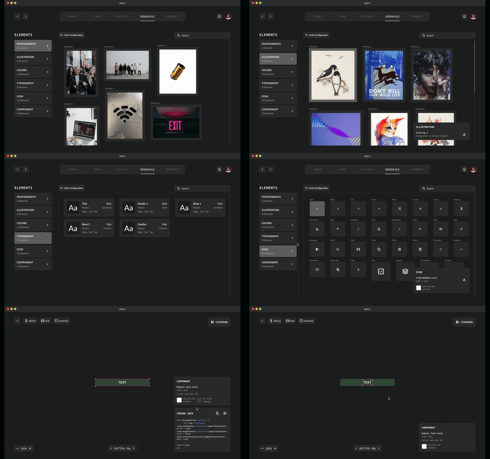
Design elements are organized automatically into different categories.
Developers are able to download the assets right away through the platform and also click to see the components in detail.
CODE CONFIGURATION
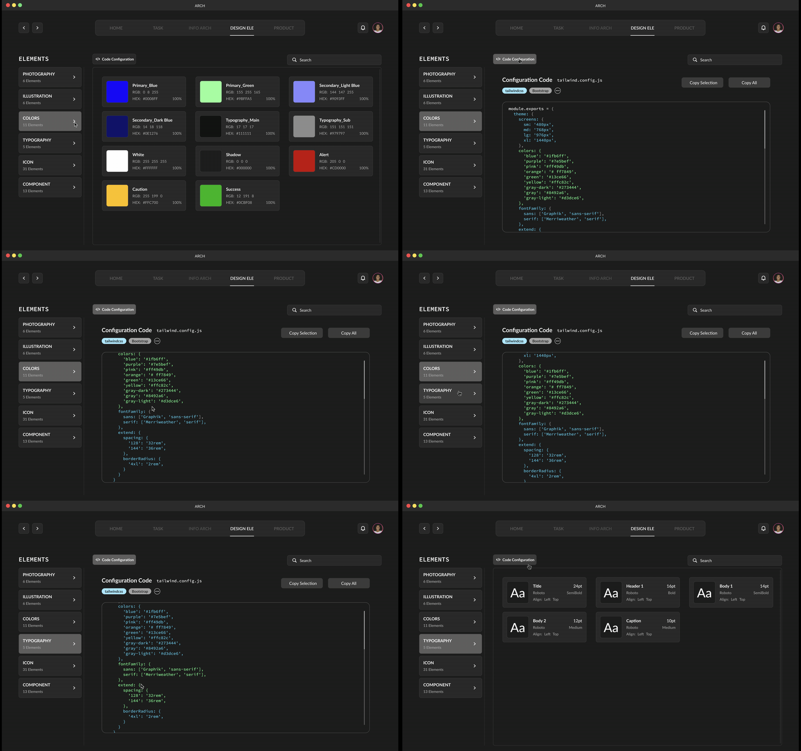
Automated code configuration for developers.
Developers can go through the code configuration provided, and simply copy and paste into their code editor.

💭 INSIGHT #2 : Screen Handoff & AI
Design feedback loops and delays cause overall project delays during developer sprints, leading to communication gaps and stress.
🚀 SOLUTION
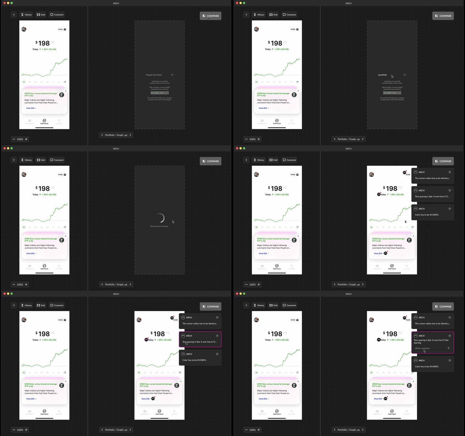
Implement AI-powered design validation tools to automate feedback processes, reducing reliance on manual QA and minimizing project delays.
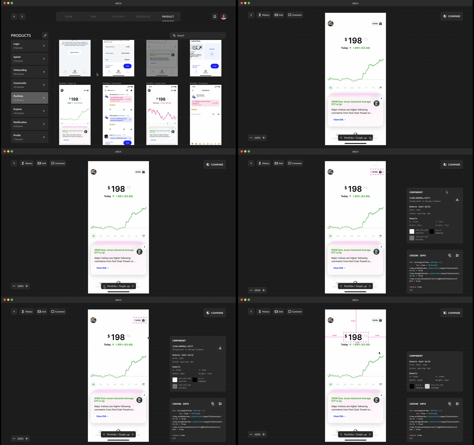
SCREEN ARRANGEMENT
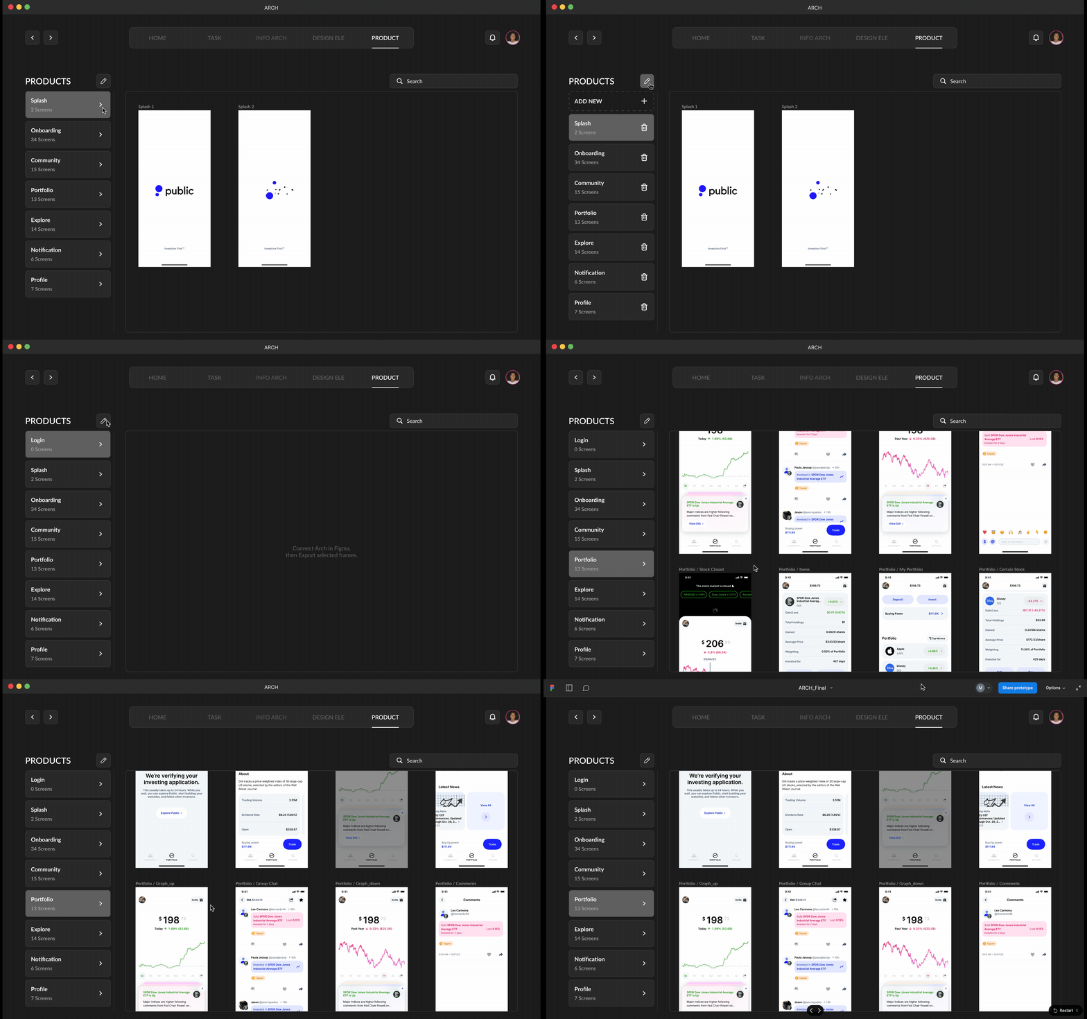
Creates category automatically when it is exported.
Screens are categorized by the name of the layer. User can also manually create or delete existing screen category.
SCREEN DETAIL
Developers are able to collect detail informations and interactions.
Assets are also quickly downloadable from this page. Simple code informations are provided on the side for developers. When mouse is hovered to screen with a component selected, it provides spacing information with pt.
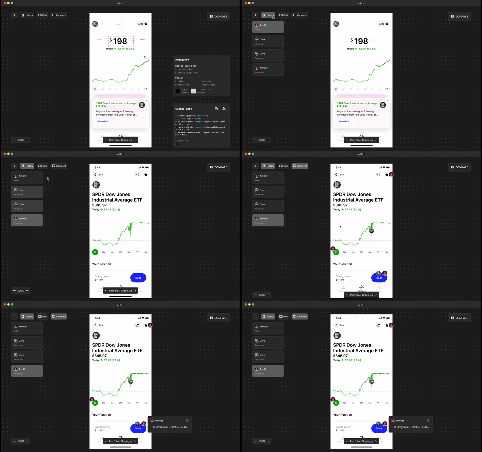
VERSION HISTORY
Keeping the past designs and comments.
Designers and developers are always able to track back with the previous designs and comments that are made.
GRID SYSTEM
Activate grid information for foundational structure for interface and responsive design.
“Grid system will provide a structure for layout and visual organization, while simultaneously delivering a framework that developers can then follow to ensure the design behaves as intended, regardless of the device used.” — Design Lab


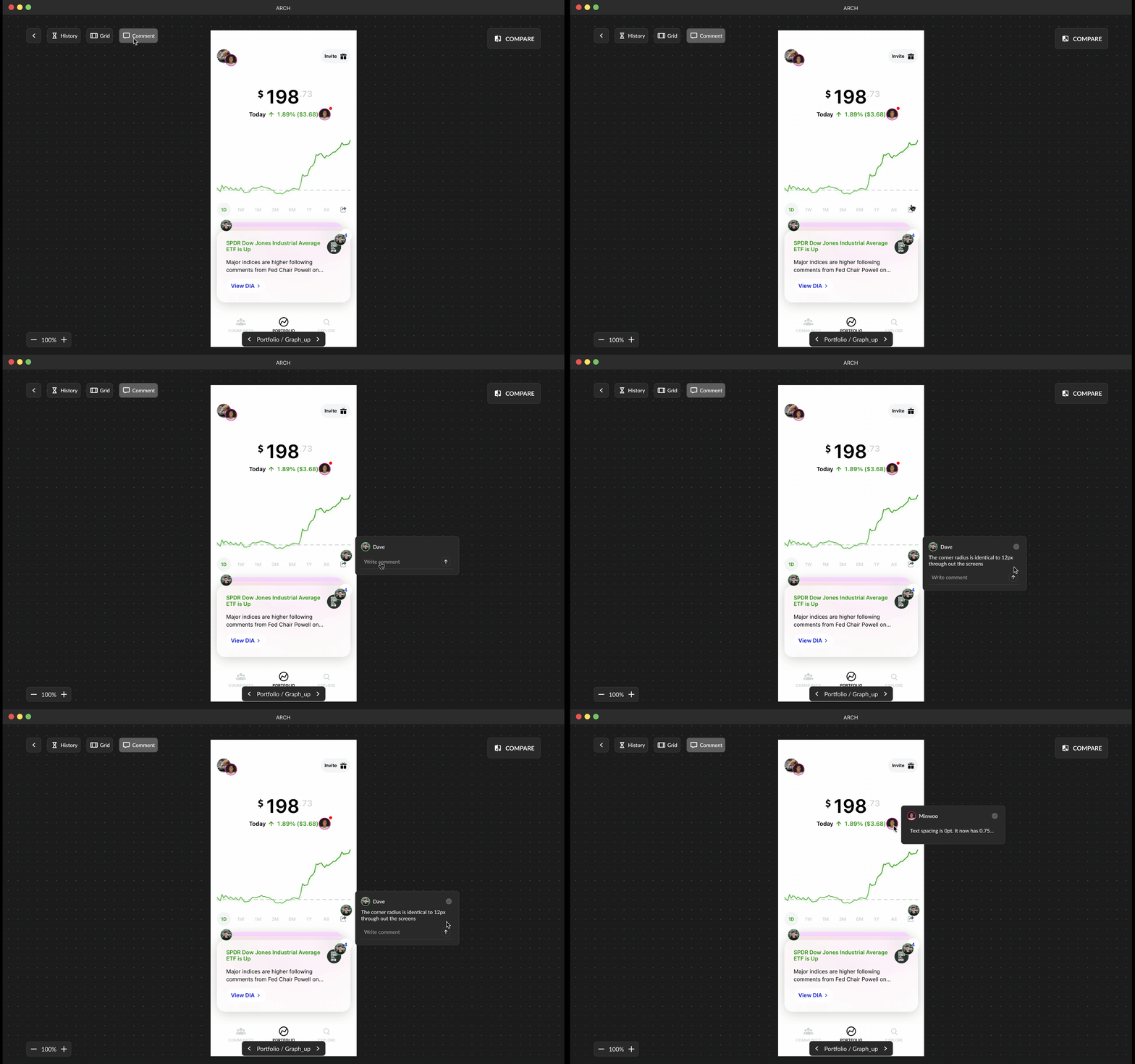
COMMENTS
Communicate the design intent and feedbacks with clarity.
Live-updated comments on design changes provide context, specs, and measurements directly linked to designs, ensuring developers stay informed during handoff.
DESIGN COMPARISON
Utilize AI for visual inspection to compare designed and developed screens.
Enhance workflow efficiency by empowering developers to conduct QA, efficiently resolving design inconsistencies, and fostering stronger collaboration.
